the design
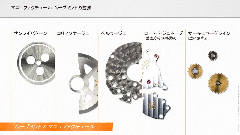
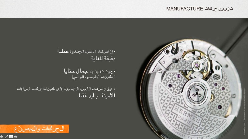
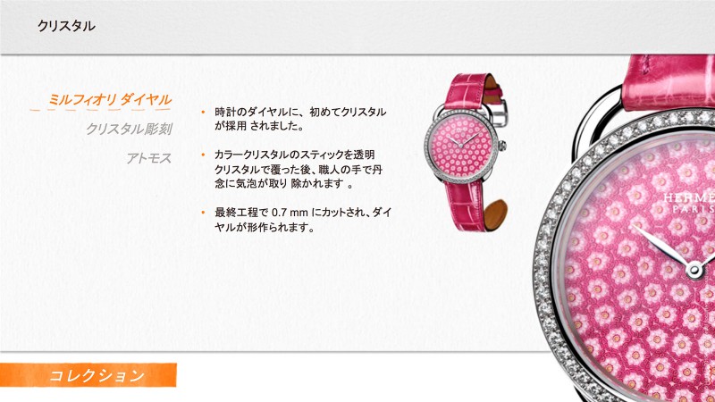
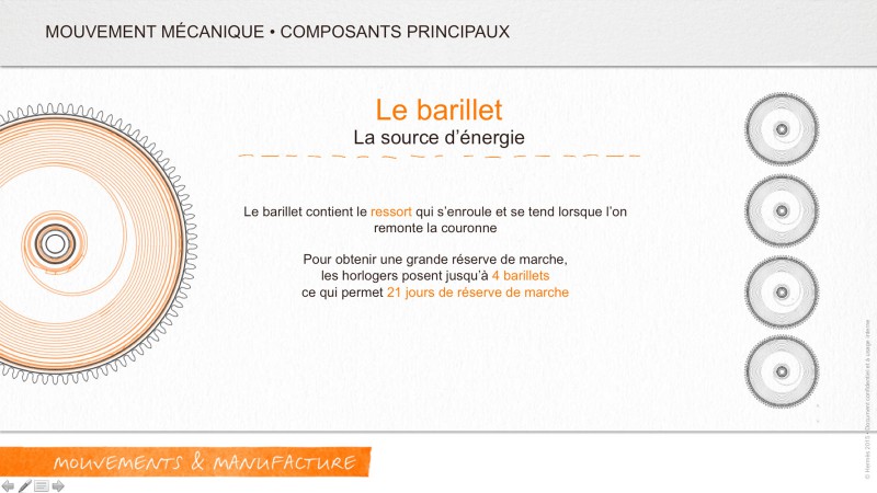
The graphic design was built around the formal vocabulary of the brand. We used the color codes, and graphical objects derived from Hermès. We had to simplify and clarify each slide in order to create an attractive, easy to read and pleasant to study content. A large proportion of the screen is reserved for large images and animations.
All texts are integrated in PowerPoint to facilitate the translation.
Each slide is then animated, very lightly in order to give an impression of motion without being too aggressive or too long.
All texts are integrated in PowerPoint to facilitate the translation.
Each slide is then animated, very lightly in order to give an impression of motion without being too aggressive or too long.


